UI/UX Lead · VirtualKey · Chicago · 2015 · iOS, Android, Web
What trust looks like when a door is the interface
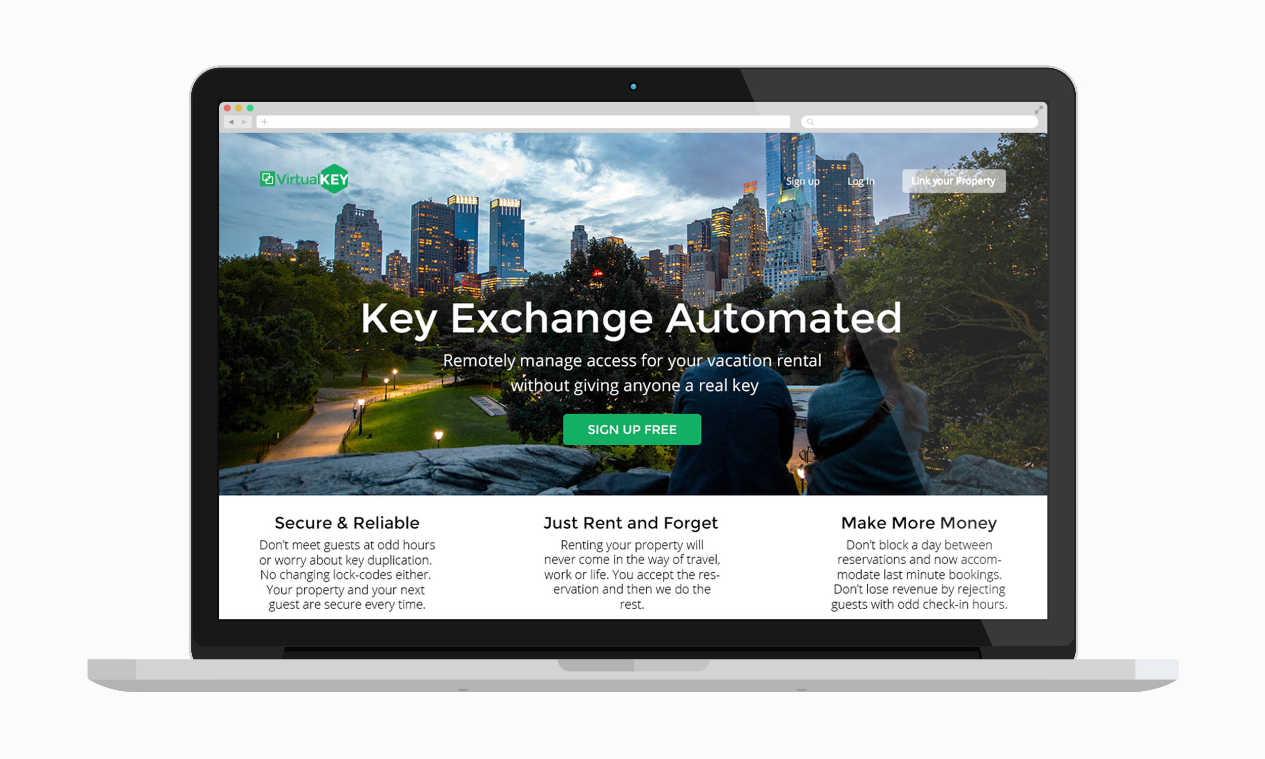
Online marketplaces and hospitality services such as Airbnb or Homeaway (now Vrbo) were growing faster than the infrastructure supporting them. Hosts were taping lockbox codes to confirmation emails or scheduling their personal lives around key handoffs. For guests, complicated check-ins and sharing a single key restricted their movement and ruined the experience.
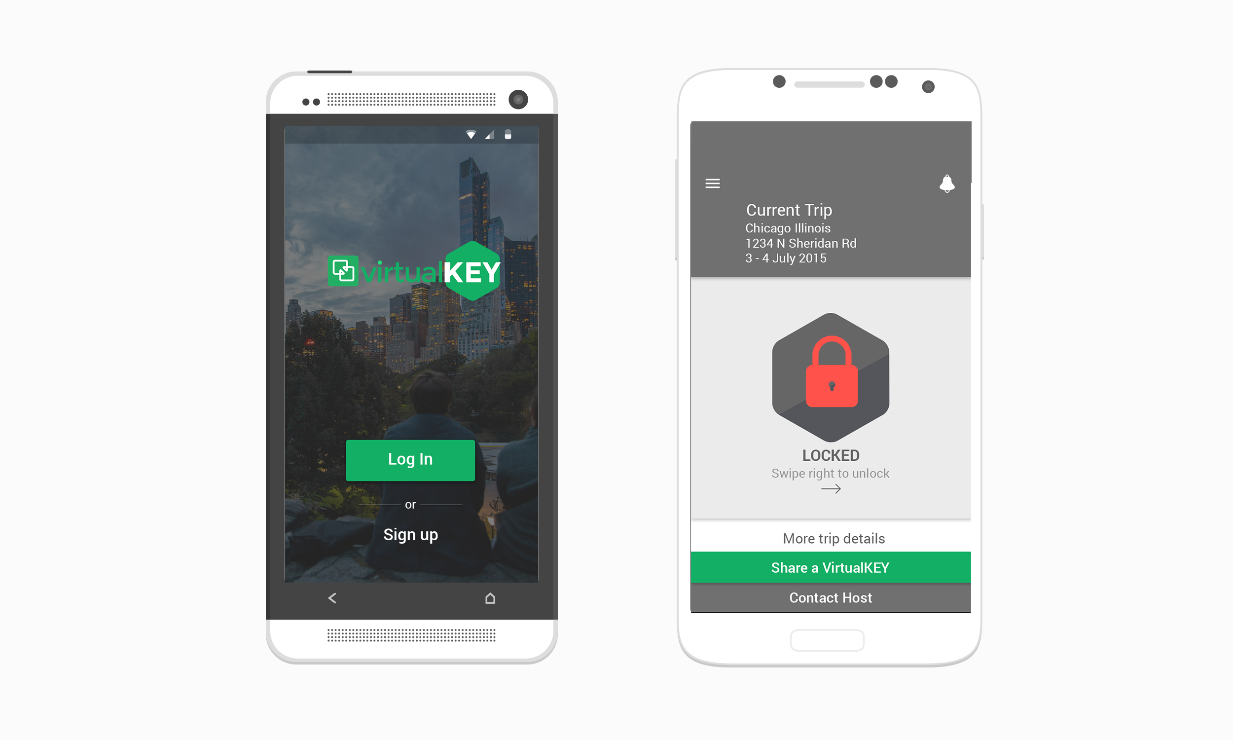
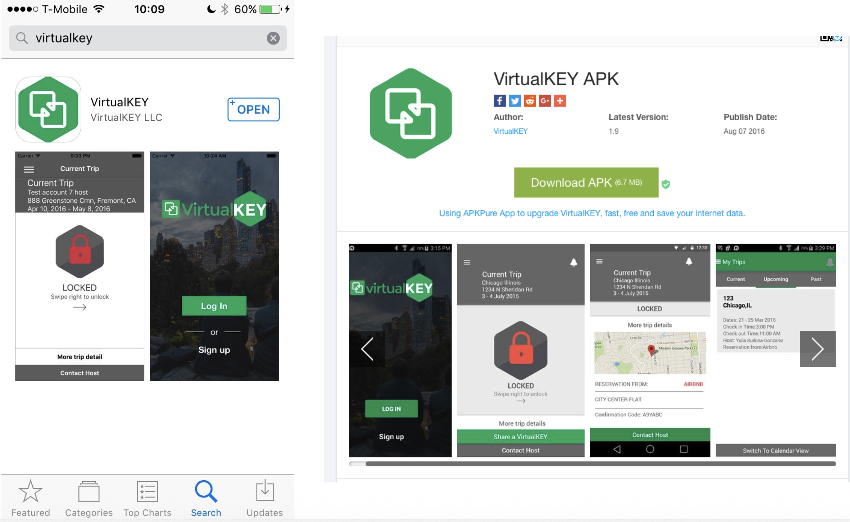
VirtualKey MVP was built specifically for short-term rentals. It replaced the physical key with a BLE credential tied to the booking — one link, one app, access that expired at checkout and worked independently for every guest in the group.
Caption: [Describe what you're showing and why it matters]
What users were experiencing
Short-term rental hosts needed to eliminate key logistics (no coordinating around their own schedule) without compromising their property's security and aesthetics (no lockboxes, no drops). Guests needed access that was truly independent: no group curfew, no waiting on whoever had the key, etc.
What the business was seeing
Short-term rentals had solved discovery and payments but left access control untouched. VirtualKey had to build a trust system that worked at the moment of check-in — without the host present, without a front desk, and with zero margin for error.
The design question
How might we simplify complex property management for hosts? I owned the full guest and host experience: the trust layer that made a stranger's phone the thing standing between a guest and their room for the weekend.
Before any pixels, what I needed to know
Methods
[e.g. "5 in-depth user interviews with HR administrators and employees, analysis of 3 months of support tickets, funnel analysis in Amplitude across 3 enrollment cohorts, competitive review of Workday and SAP SuccessFactors."]
Research artifact — journey map, affinity map, or session screenshot
Caption: [What's shown here and what it revealed]
What I found
The insights that shaped the direction
Ideation & exploration
[Describe 2–3 directions you genuinely considered. What made you pursue or discard each one?]
Exploration — sketches, wireframes, or option analysis
Caption: [What you explored and why this direction won]
The most important section. Each decision shows the tension, the choice, and the tradeoff accepted.
What we shipped
[What shipped or was proposed. Focus on the 2–3 moments that do the most work — not every screen. Each image needs a sentence explaining the decision it represents.]
Caption: [Decision this screen represents, not just what it shows]
Caption: [What changed, why, and what tradeoff it represents]
Supporting screen, edge case, or system detail
Caption: [Why this detail mattered]
| Results | What we found | ||
|---|---|---|---|
| [e.g. Enrollment completion rate] | [X%] | [Y%] | [+Z%] |
| [e.g. Time on task] | [X min] | [Y min] | [−Z%] |
| [e.g. Support tickets / week] | [X] | [Y] | [−Z%] |
[If no hard metrics: describe qualitative signals — stakeholder response, user feedback, what the team prioritized next as a result, whether the approach was extended to other surfaces.]
My specific contribution
[One clear paragraph. What decisions did you make personally? What did you own end-to-end? What did you influence without owning? What did others own?]